Bleed and Crop Marks: What They Actually Mean
Open a print-ready wedding invitation PDF and measure it, and a 5×7 card comes out 5.25×7.25 inches. That's not a mistake — it's bleed, and understanding it is the difference between an invitation with a clean edge and one with a thin white sliver where the paper shows through.
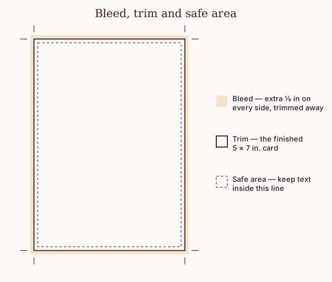
Why the extra quarter inch exists
A cutting blade — whether it's a print shop's guillotine or the craft knife on your kitchen table — is never perfectly precise. It drifts by a fraction of a millimeter, and that fraction lands somewhere. If your artwork stops exactly at the card's edge, a blade that drifts inward by even a hair leaves a thin white line of bare paper where the ink should be.
Bleed is the fix: the background color or pattern is extended past the actual edge of the card, so a drifting cut still lands inside ink, not paper. The standard amount is 0.125 inches (⅛ inch) on every side — enough to cover realistic cutting drift without noticeably changing the design. A 5×7 card with bleed becomes a 5.25×7.25 inch page; the extra quarter inch (an eighth on each side) is discarded the moment the card is trimmed to size.
What "trim to the crop marks" means
Crop marks are the small guide lines printed just outside the bleed area, at each corner — you can see them in the diagram above. They mark exactly where the finished card's edge should be. When you tell a print shop "trim to the crop marks," you're telling them to cut along those lines, discarding everything outside them (the bleed) and keeping everything inside (the card).
This is also the one sentence worth memorizing if you're placing an order yourself: "trim to the crop marks, there's an eighth-inch bleed." Any shop that prints wedding stationery will recognize both phrases immediately.
The safe area: what not to bleed
Bleed protects the background from a drifting cut. It does nothing to protect text — a name or a date sitting right at the trim line could still get clipped by a cut that drifts the other way, inward. The common rule of thumb is a safe area: keep anything you need fully readable — names, dates, body text — at least an eighth of an inch inside the trim line, not right up against it.
Backgrounds, patterns and illustrations can safely bleed to the edge; anything a guest actually has to read shouldn't sit closer than that safe-area line.
What this looks like in practice
- A background color or pattern — extend it to the outer edge of the page, past the trim line, into the bleed.
- Text — keep it inside the safe area, comfortably clear of the trim line.
- A border or frame drawn close to the edge — this is the one detail worth checking twice, since a thin frame sitting exactly on the trim line will look uneven if the cut drifts by even a little.
Every file Promuse generates already carries the 0.125" bleed and crop marks built in — designed to that spec by default, not something you add before sending it to a shop.